Pukka
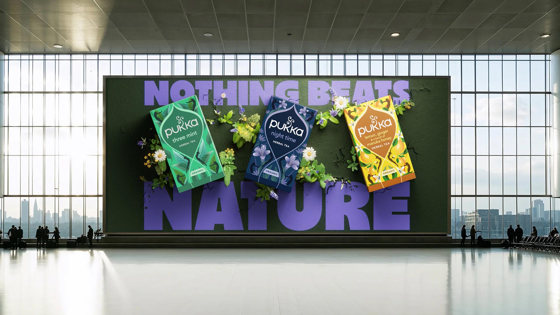
Nothing Beats Nature
Pukka
Nothing Beats Nature
Pukka needed to win over health‑minded consumers who saw fruit and herbal tea as more functional than feel‑good. So we repositioned the brand as the antidote to over‑engineered self‑care: no 12‑step routines, no performance, just simple herbal wellness in a cup.
Tapping into the post‑pandemic obsession with optimisation, our “Nothing Beats Nature” platform reframed Pukka as the most natural and simplest answer to modern wellbeing. In doing so, Pukka reminded people that in a world of hacks and hyper‑products, herbs are the original (and still the best) wellness technology.
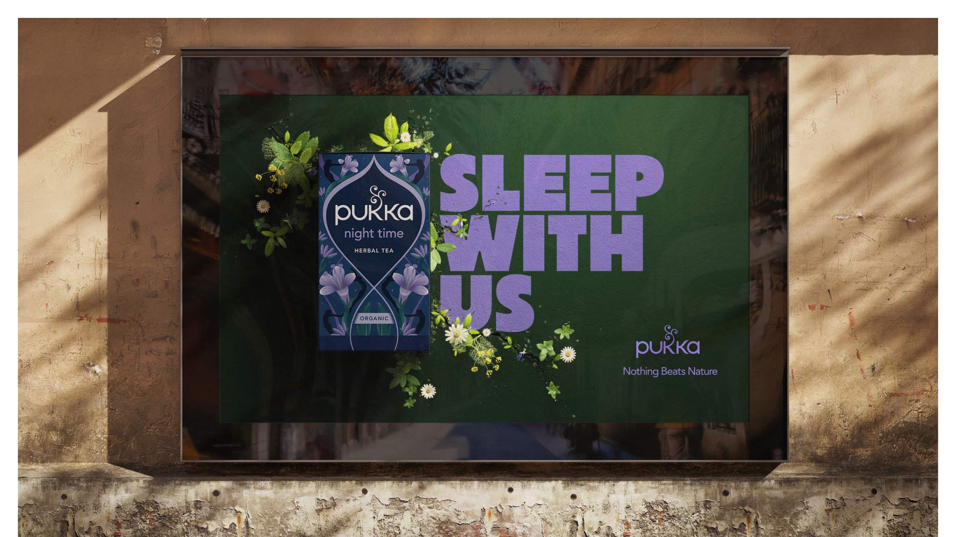
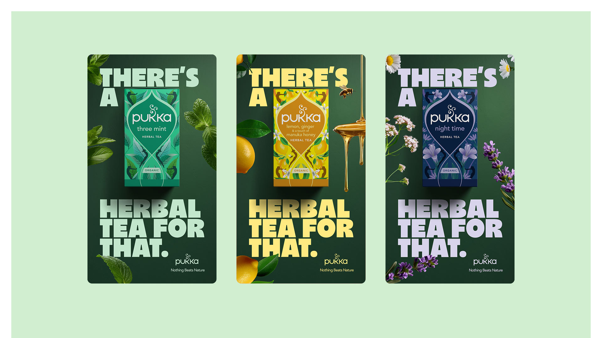
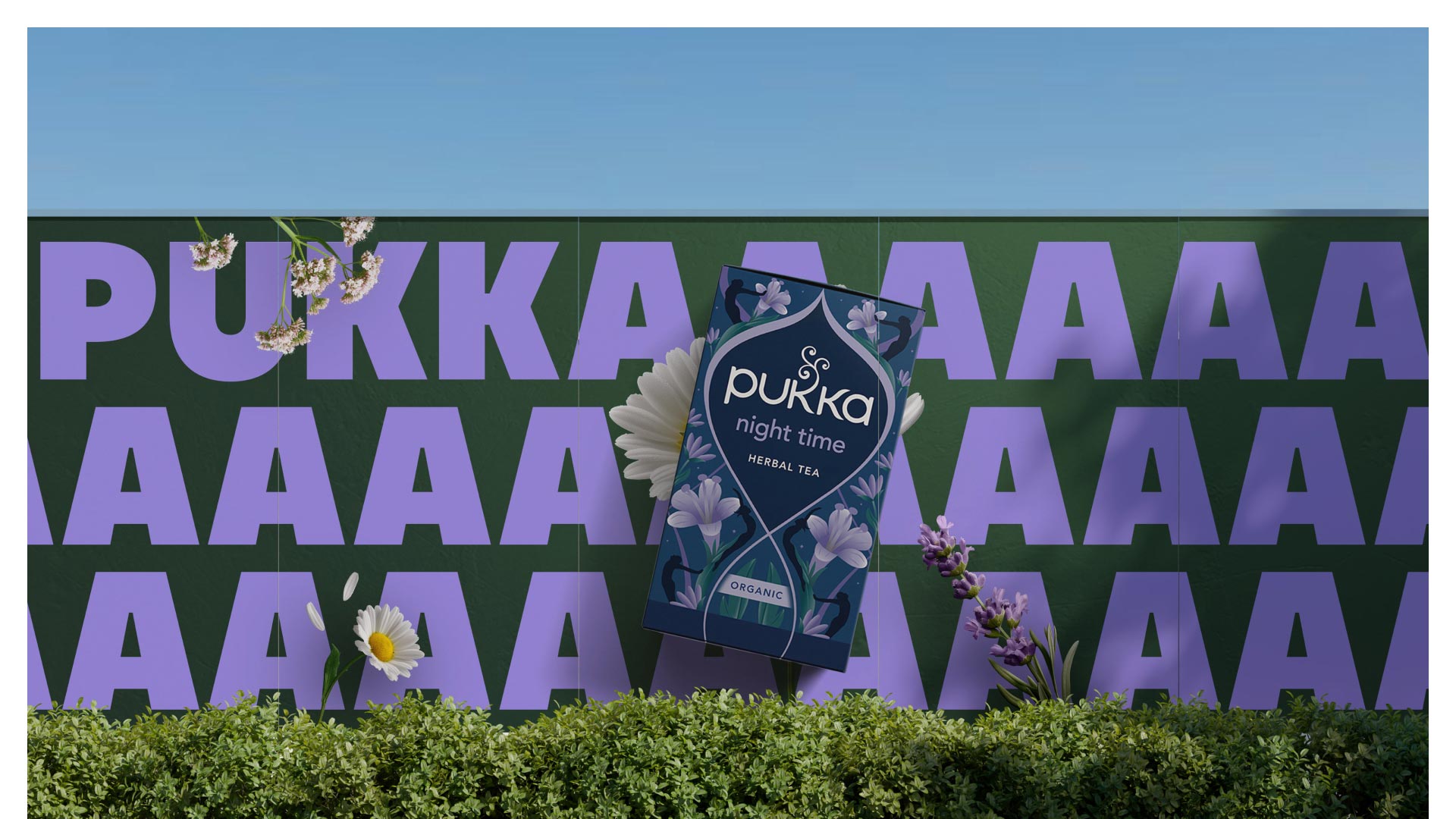
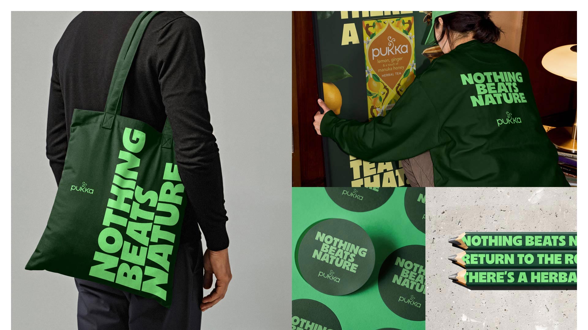
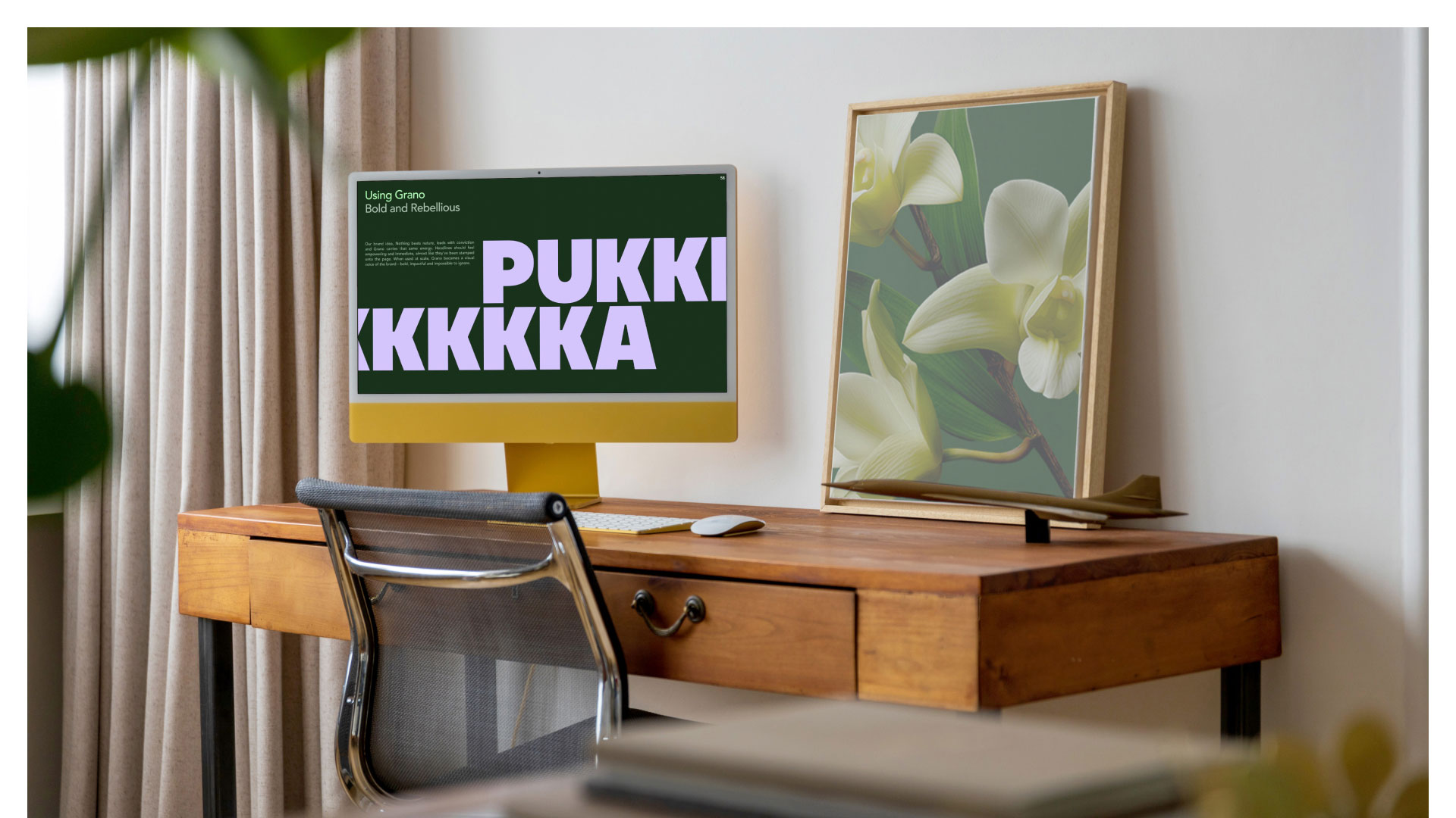
Our refresh reimagined Pukka's visual identity to capture that spirit, creating a richer, more expressive brand system that celebrates the power of herbs while giving the brand a distinctive presence across every touchpoint. By translating the vitality of herbs into a cohesive visual language, we created a design system that is both emotionally engaging and strategically distinctive—helping the brand stand apart in a category that too often defaults to quiet, conventional expressions of natural wellbeing.
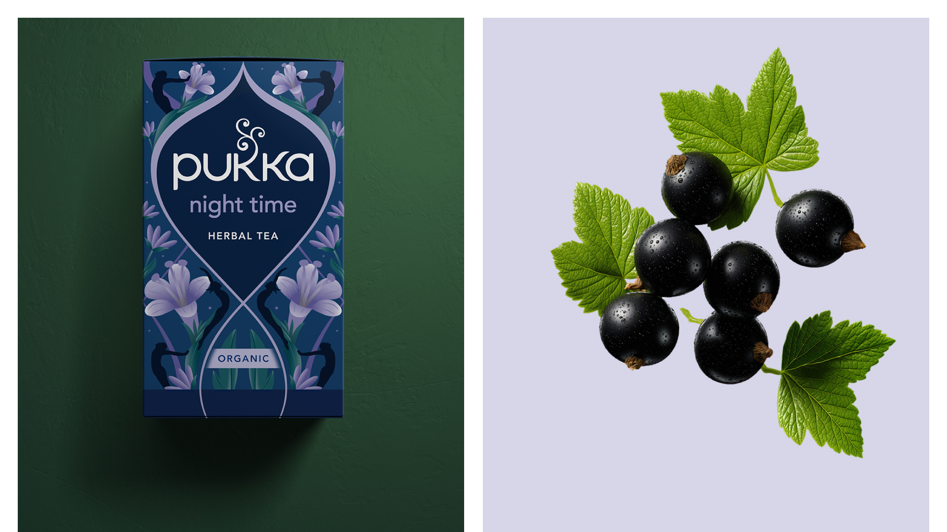
We moved away from the muted, pastel palette that dominates the category in favour of richer, more vibrant colours inspired by the intensity of nature itself. Higher contrast and bolder combinations bring greater energy to the brand while allowing each herbal blend to express its own unique character.
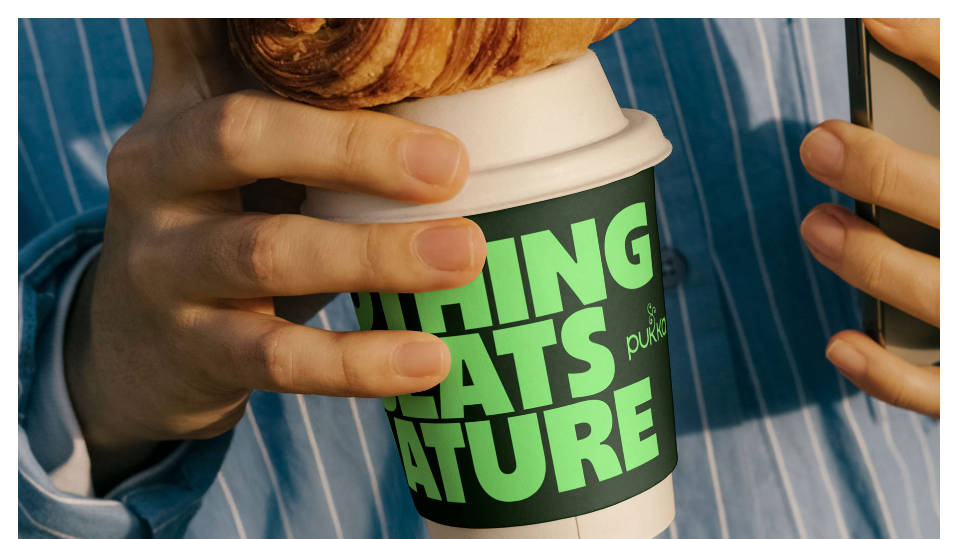
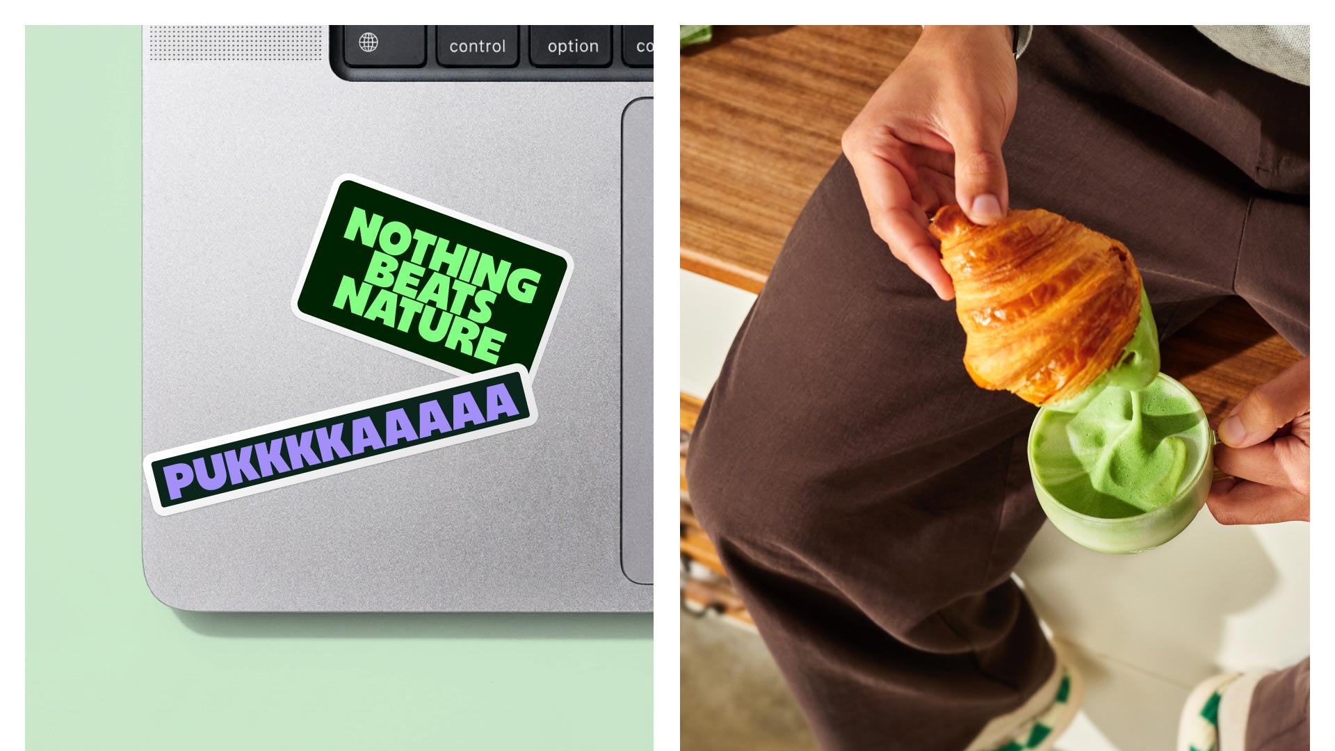
The art direction brings the "Nothing Beats Nature" philosophy to life through images that feel lived-in rather than styled. Natural light, dynamic compositions and authentic moments replace category clichés, creating a visual world that feels energetic, contemporary and grounded in real life.